Corning Inc is a leader within the Material Science space, known for inventing "Gorilla Glass"; a glass that Apple asked if Corning could make for the first iPhone. At Corning, I work with a team that creates digital tools to advance material discovery. Part of the effort is to make software that not only functions well but also designed with users at the heart of the experience.
The Objective
Leading a team of designers to create robust tools with a common UX architecture, an experience centered around users, and the ability to augment scientists' skills and extend their knowledge.
1
Common UX Architecture
I designed the UX architecture to facilitate the adoption of a new platform by defining the system objects, behaviors, and overall framework shared across the emerging application modules.
2
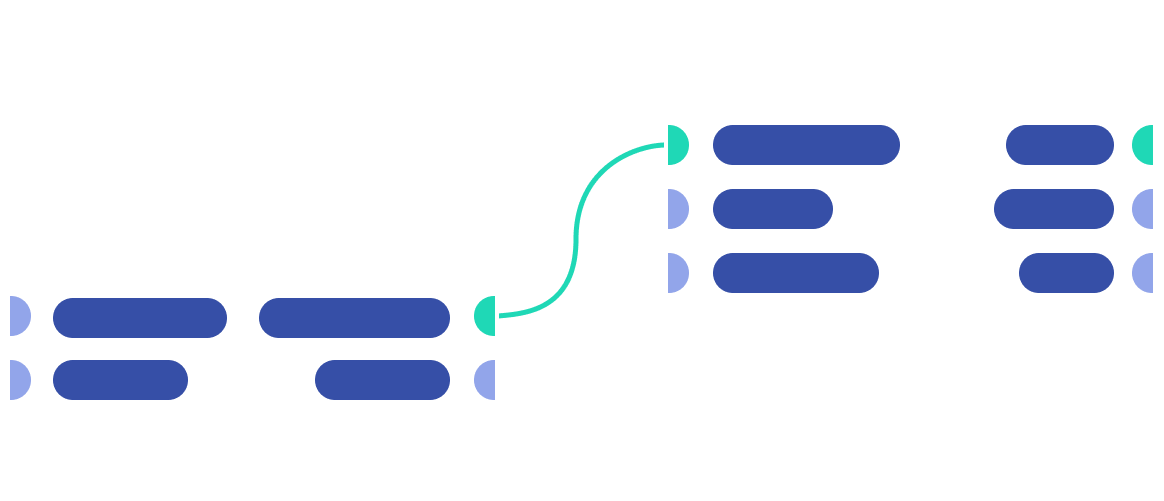
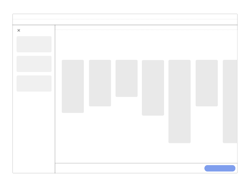
Regions and panels
Regions
I started by defining the spaces which included the main stage for displaying information or facilitating interactions within the app.
Panels
To contain objects and display their properties, I designed panels that are lightweight containers that may either stand-alone or be connected to an object, such as a node, and display contextual elements related to that selected object.

3
Mechanics & Behavior
Beyond defining the size and location of the panels and regions, I worked on setting the mechanics of each one. These mechanics include their area and directional properties
4
Interaction model
A consistent interaction model based on the unified regions and panels resulted in a uniform and predictable user experience. Rules such as users can easily add objects to the stage, which allows for bi-directional movement depending on the specific application needs.
Creating tools to make tools
One of the main goals was to empower users to create tools and workflows of their own. Such an ambitious objective required a design approach that depends on the ability of components to be modular and flexible.
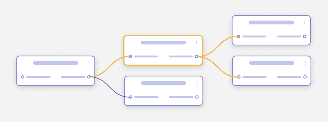
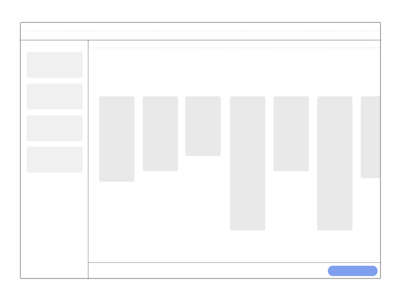
Node Based
The tool created utilized a node-based user interface to provide the most flexibility in constructing workflows and processes
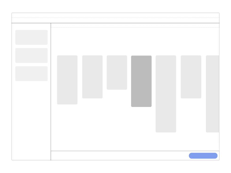
Anatomy of nodes
The nodes' design required a meticulous breakdown of all its parts and precise instructions on how they function as a single unit
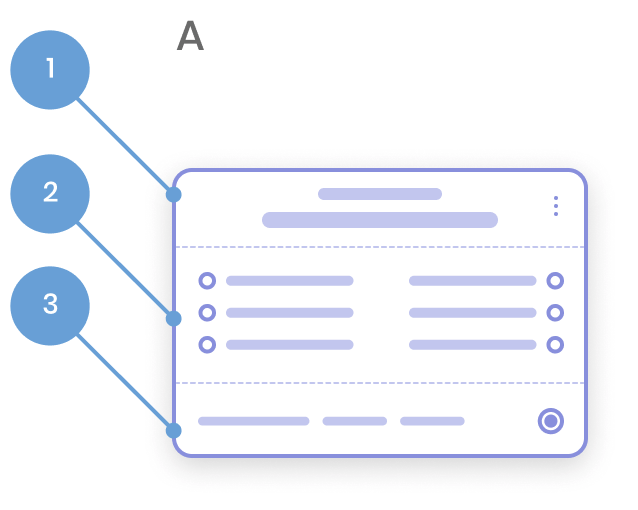
A. Regions
- Node title (top text represents the action type and the bottom sub text represents the sub action) and the menu icon provides access to utility actions.
- Body
- Status
B. Interactive Regions
- Clicking the body, selects the node, and activates the parameters Pane. Clicking and dragging allow for repositioning of the node within the stage.
- Clicking the status region activates the bottom status drawer related to that selected node.
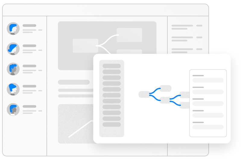
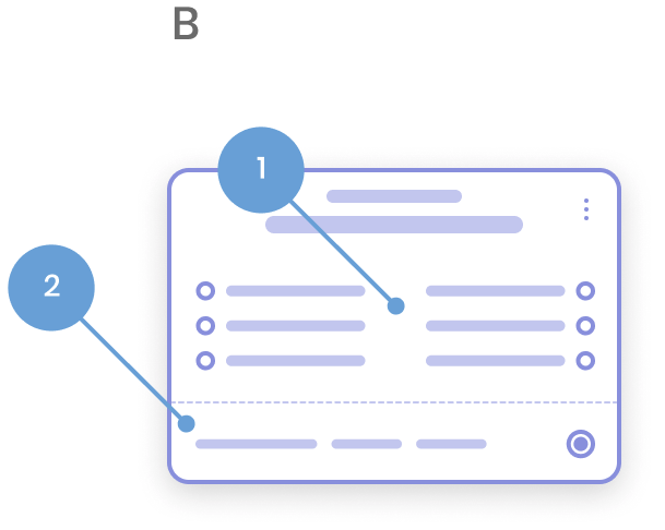
Parameters
The parameters panel is a core area for inputting and managing the values and controls related to a selected node. Therefore the property panel was designed to be flexible so it can contain a mixture of UI components with varying levels of complexity.
Credit: Parameters Anatomy design execution by Tim Stegner
Selected Works

Instagram AchievementsProject type

Instagram ReviewsProject type

GoogleUX • Visual Design • Mobile

CorningProduct design • Visual Design • Web App
Email: hello@alialithinks.com
Dribbble: @alialithinks
Linkedin: alialithinks
© Ali Ali 2024