
We all know the story. Aladdin stumbles upon a magic lamp, and a booming voice erupts, offering him three wishes. Three. But what if it weren't three? What if the genie offered five wishes or ten in a stroke of mischievous generosity? Would Aladdin's tale be as eternally etched in our minds? Or would the magic – the sheer memorability – of his three desires be lost in a sea of limitless possibility?
This is not just a whimsical thought experiment. It's a window into the hidden power of the number three, a force that shapes our world in ways we never suspected. From the captivating trilogies of childhood to the seemingly mundane design choices that govern our daily interactions, number three exerts a subtle yet undeniable influence on our cognition.
For years, product designers have been quietly exploiting this quirk in human psychology, using the power of three to nudge users toward specific actions, frame their decisions, and ultimately, shape their entire user experience. I'll list a few areas and show examples of how the "power of three" was applied, so you can utilize it in your design.
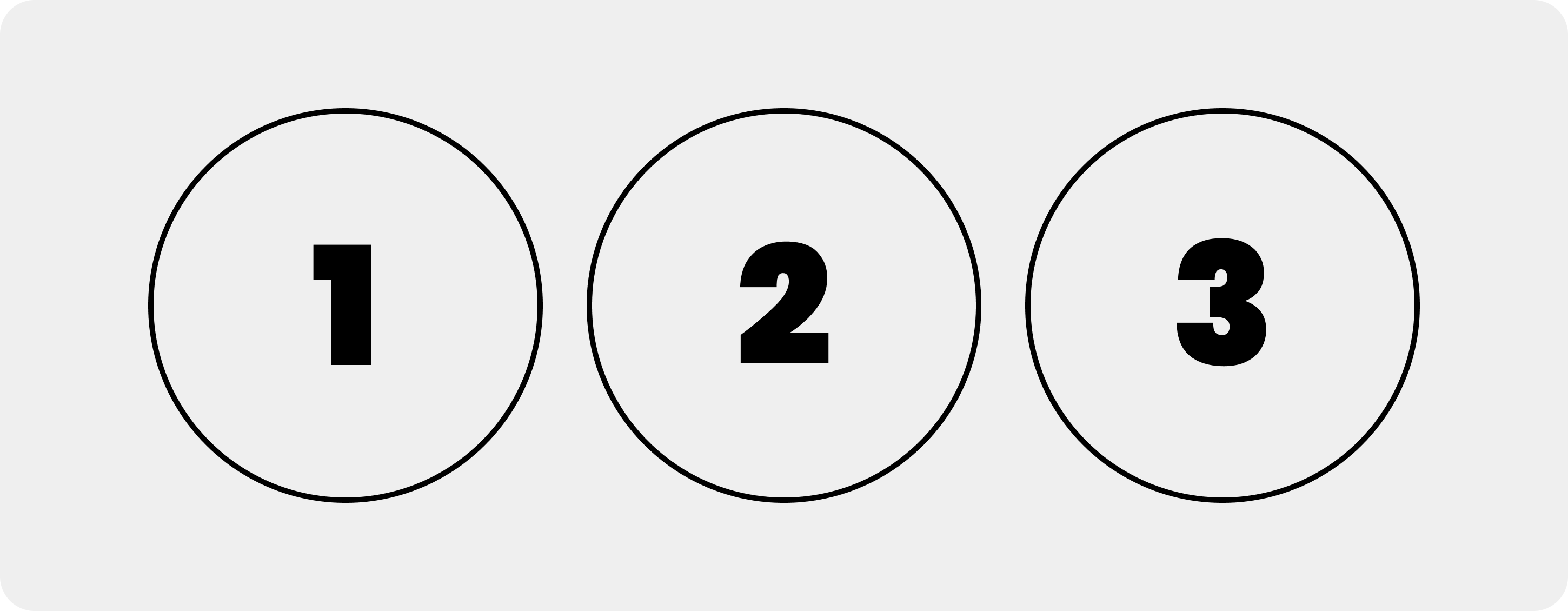
1. Cognitive processing: Our brains are wired to process information in chunks. Three elements are considered the "magic number" for short-term memory because it's the optimal amount for immediate recall and processing without overloading our cognitive resources.
Ladislav Kováč discusses this phenomenon in “Causal reasoning: the ‘magical number’ three”
Example: A product onboarding process with three key steps is easier to follow than a long, multi-step process.
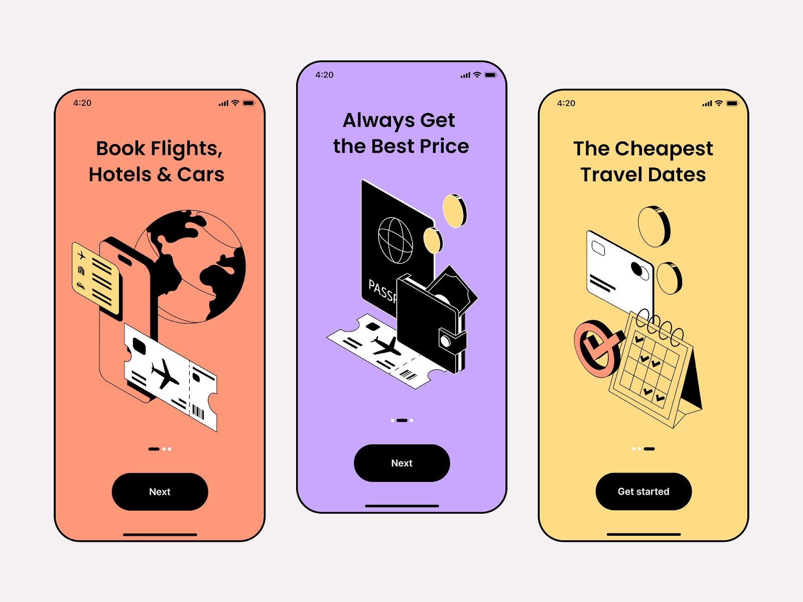
2. Hierarchy and Prioritization: By using three elements, designers can create a clear hierarchy, guiding users towards the most important information or actions.
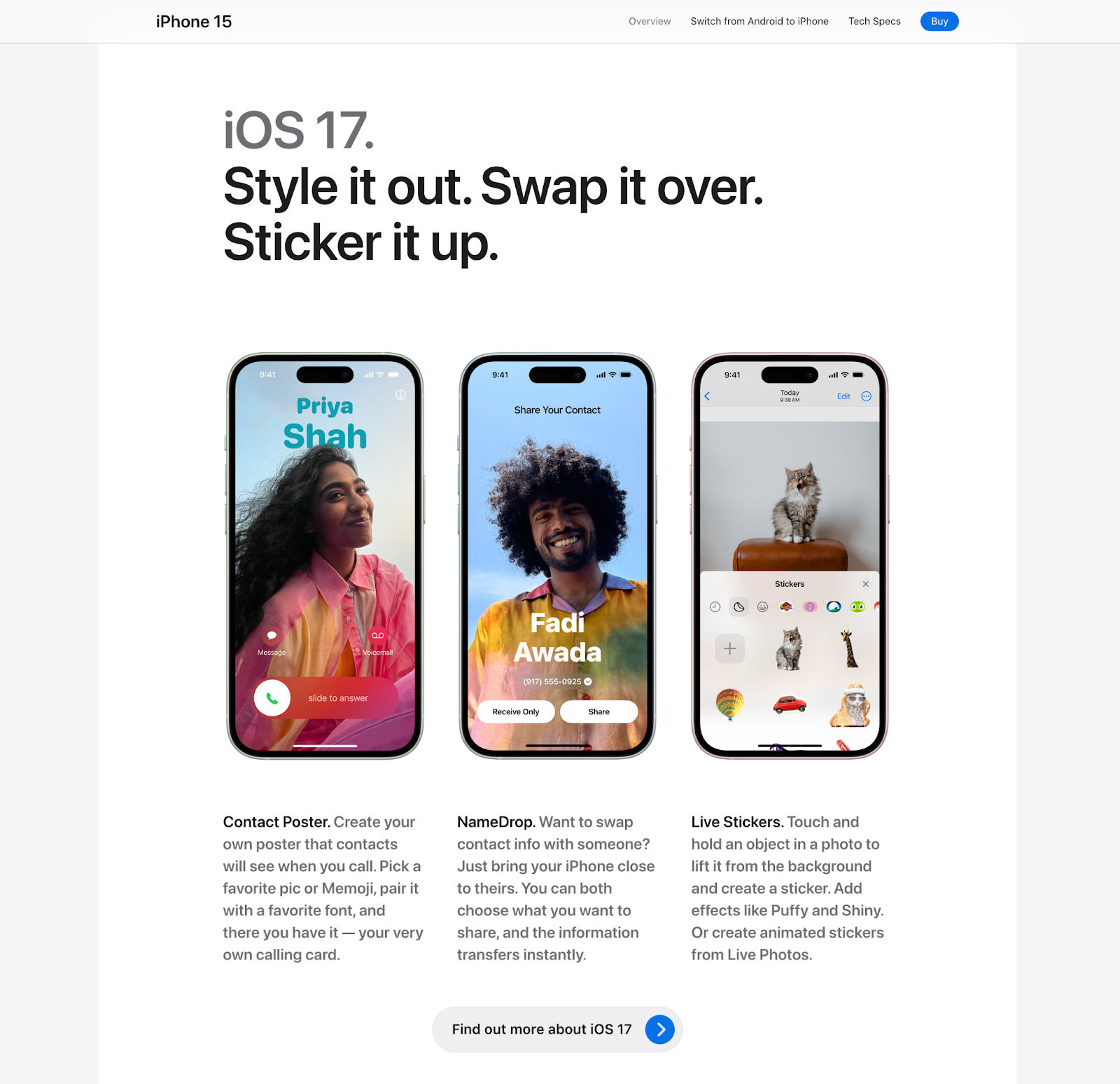
Example: A product landing page with three prominent features encourages users to explore those specific functionalities first.
3. The Rule of Three: This principle in storytelling suggests that presenting information in threes makes it more memorable and impactful.
Example: Product descriptions with three key benefits are more likely to resonate with users than a long list of features.
4. Increased User Confidence: Three options can provide a "just right" feeling, not overwhelming users with too many choices but offering enough variety to feel empowered.
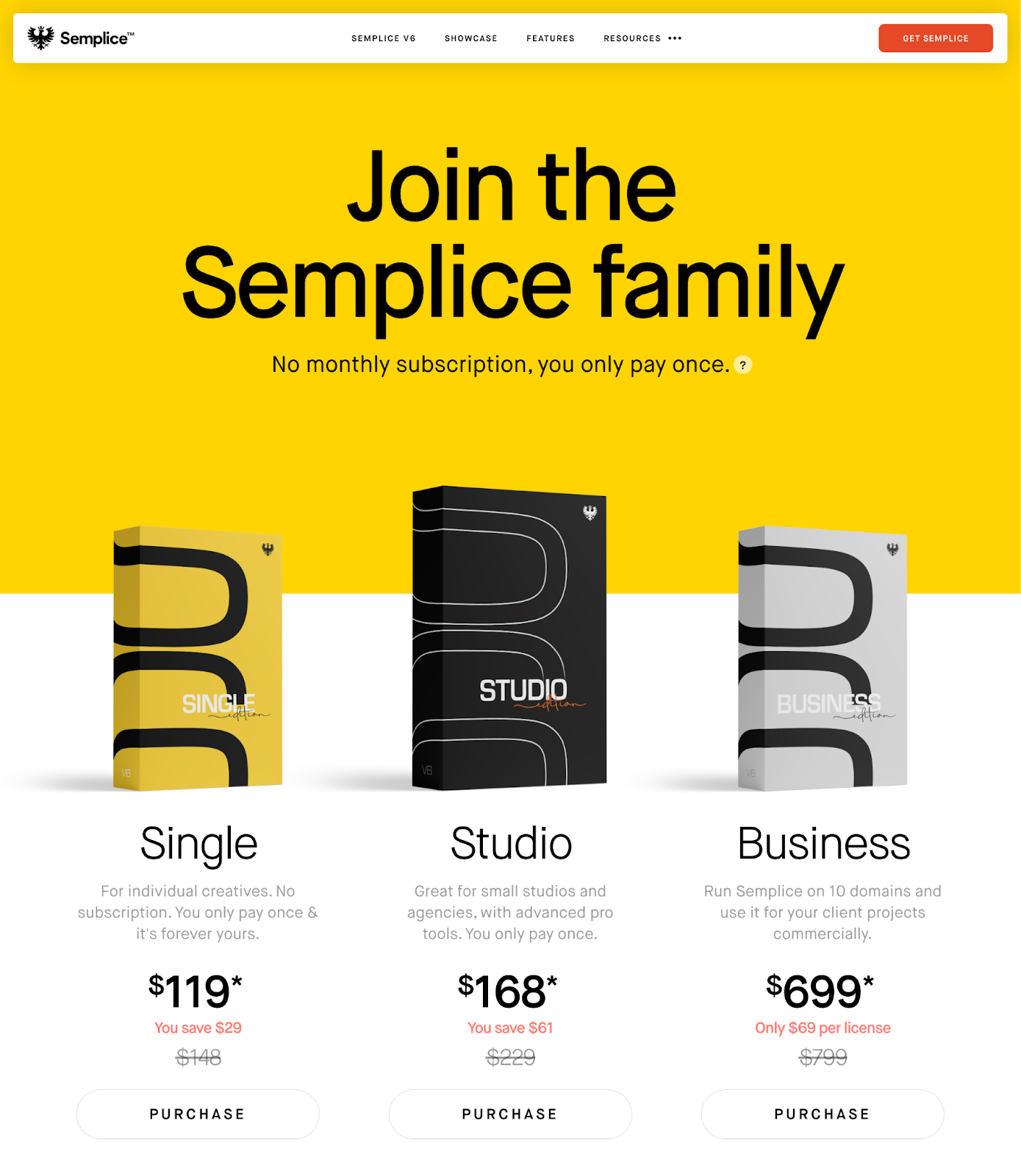
Example: A pricing plan with three options (basic, pro, enterprise) allows users to find the best fit for their needs without feeling like they have to spend hours comparing countless plans.
However, it's important to note:
Overuse can Backfire: Repetitive use of the number three can become predictable and lose its impact. Opt for variety within your design.
Context Matters: The effectiveness of the number three depends on the specific product and user needs.
Here are some additional ways to leverage the power of three in product design:
- Use three-column layouts for product comparisons or information organization.
- Create tutorials with three key steps.
- Design progress bars with three stages.
- Highlight three customer testimonials.
Designers aspire to create products that are intuitive, effortless, and a joy to use. Often, the answer lies in restraint.
Of course, there's always room for innovation and added complexity. But simplicity should be the guiding principle. So next time you approach a design challenge, consider the power of three. It might just unlock the elegance you've been searching for.